Part 1: ASSIGNMENT
You have 3 weeks to pitch Universal Studios... Ok, sounds intimidating, but the opportunity to work on properties that I not only enjoy as a fan but also reference for my creative inspiration was an opportunity I jumped at. The biggest challenge I foresaw was translating cinematic stories into engaging gaming content. I did not want to simply port assets to the casual game forum I was working in as others have done before. I felt that approach did not properly homage such a great catalog of films. I wanted to give players a deep dive immersion into these properties they knew and loved and make something I’d personally like to play. I determined it was my goal to somehow show this commitment level to Universal.
While there were other concept tracks taking place for this pitch, the work shown here is what I was responsible for and/or created.
My first step was to define the level of illustration I would use on the actor imagery as this was a major focus of each game. Before I was made aware of the legalities in using actor likenesses, my idea was to homage the look of illustrated movie posters and classic illustration.
A few artists I referenced included Thomas Jung, JC Leyendecker, Richard Amsel and Drew Struzan. Some contemporary artists such as Paul Shipper, Jason Edmiston and Alex Ross were also looked at because they all currently work as artists in the entertainment industry.

from left to right: JC Leyendecker, Richard Amsel, Drew Struzan, Paul Shipper, Jason Edmiston, Alex Ross

PART 2: PRE_PRODUCTION
CHARACTERS
I personally illustrated some samples of a few select actors to set the visual tone I was after so I could easily share my visual intentions. Because this was purely conceptual I was concerned the reference I had to offer of the above mentioned artists might be a quality level too intimidating to the resources and the time frame I had to work with. I decided actual samples would be a great way to express where we could cut corners for the pitch. These purely speculative samples also allowed me to wrap my head around the entire project. For instance, the black and white Hans Gruber below was a digitally painted copy (right) of a watercolor (left) by the artist Bill Sienkiewicz. I loved the unrestricted qualities of his work and in my exploration phase considered pushing the game assets this far at one point. This level was never used, but by doing a quick mock-up (2 to 3 hours of work) I was able to rule it out. At the same time, I also made the decision to record some of my process steps to formalize a cohesive pipeline. Unfortunately, because these paintings were produced rather quickly I wasn’t totally satisfied with the results. The faces I chose were not the most dynamic, they were pretty safe. They lacked good expressions and the poses were pretty rigid. This was because I was really trying to nail down a look and wasn’t overly concerned with any real visual appeal at this stage. Playing it safer gave me the opportunity to really focus on the task at hand. I then moved onto the playfield template design right after this to keep my momentum moving forward as the clock ticked away.

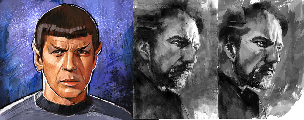
first test painting, looking for style

INTERFACE DESIGN & SETUP
Portrait orientation was settled on for the playfield configuration. It was a playfield format not previously used before by the studio prior to this pitch so I developed the look of the cabinet, the UI wireframes and a variety of deck options to choose from. This step was necessary because I needed a place to present the work that was being produced and it’s always best to show work in context. I also created placeholder zones for additional thematic features that were slated for the game (such as thematic mini-games and video clips).
SHARED MINORS
I then created a set of symbols sometimes referred to as low pays or royals for the pitch. The variety of games I was working on needed a unifying element for an overall visual connection and the minors presented the perfect solution. I decided to homage the Universal logo by replicating the same look and feel of the font styling used in its design and ended up with minors that could work with any Universal Studios property.
THEMATIC PEDESTALS
Conceived as a subsection of the playfield interface this element was designed to serve as a transition of the film property into the game world. This line art I produced was handed off to an outsource team to paint.
For the Bourne film series I chose the rooftops of Tangiers from the Bourne Supremacy film where Jason fought Desh in his efforts to protect Nicky.
For Xena, I created a mashup of themes from the series. Because there was a lot to choose from with Xena this miniature was actually difficult to envision. There wasn’t one simple area to depict so I had to logically piece together imagery from a show that had a wild range of storylines. 
These zones also provided a place for social interaction among players which was a top-level directive for the overall pitch. If you notice, each mini pedestal has a set of leveled platforms that was designed to specifically house mini slot machines. The arrangement of these mini machines on this diorama were meant to resemble how banks of slot machines are typically displayed in a brick and mortar land-based casino.
Part 3: ART DIRECTION
Although I did produce a large majority of the content myself for the pitch, due to time constraints I could not do it entirely alone. I enlisted the help of an outsource group to assist with tasks such as painting the pedestal miniatures and whatever character portraits I couldn't handle.
This is the actual art direction brief and reference I provided to the outsource team to guide them in the miniature painting.
The line art you have been provided depicts a moment or symbolic reference to its related property. The goal when painting this line art is to mimic the look of miniature dioramas that have been constructed from parts or materials found in plastic model hobby kits.
Because these miniatures will be small on device, IT’S VERY IMPORTANT THAT THE SHAPES AND INDIVIDUAL LEVELS (foreground, middle ground and background levels) HAVE A DISTINCT VISUAL SEPARATION AND ARE CLEARLY LEGIBLE.
Light the models as if they’re lit by an interior room light source (above and to the right is preferable)
LIGHTING THE MINIATURES
•  do not use direct light, the miniatures should be lit with a general ambient that lights the object with a wider spread of illumination
• overall lighting should have a larger, more liberal application to its spread. this is a great way to show how stone of a plastic model differs from stone in reality.
• use larger shapes of specular (hot spot) light to visualize a light source which is often closer in proximity to the subject when plastic models are photographed
• no cast shadows, unless you find they can be useful in separating big shapes or form profiles
• use soft form shadows to reinforce the indirect light source
PAINTING/ RENDERING THE MINIATURES
•  mimic real world materials and textures, but KEEP THE DETAILING BIG AND STYLIZED so it shows up at the small device size. If the details are too fine they will not be seen at a small size
•  work with values and hues that are real world accurate, but feel free to push those colors toward a realistically “enhanced” palette
•  avoid rendering with 90 degree angles/ corners to emphasize the tolerance limits of a typical mold used for models
Attached are references of plastic hobby models to provide you with some visual direction to work towards.
part 4: CONCEPT PRODUCTION - Spartacus
After looking at a bunch of properties we decided to go with Spartacus as the first game in the pitch. We wanted to show Universal how we can incorporate a classic property into the game environment and make it feel contemporary to players.
CHARACTERS
As the outsource team began work on the miniatures, I decided to lock down the look of the portrait paintings and painted the final characters for Spartacus myself. These images ended up serving as the benchmark for the other games to come and because I did the work, I was able to polish my initial technique write-up and provide a more comprehensive walkthrough to the outsourcers to ensure more predictable results. I didn’t have a lot of time for back and forth with the outsource team, because of the other work I was doing for the pitch, so having these paintings as reference helped alleviate that need greatly.

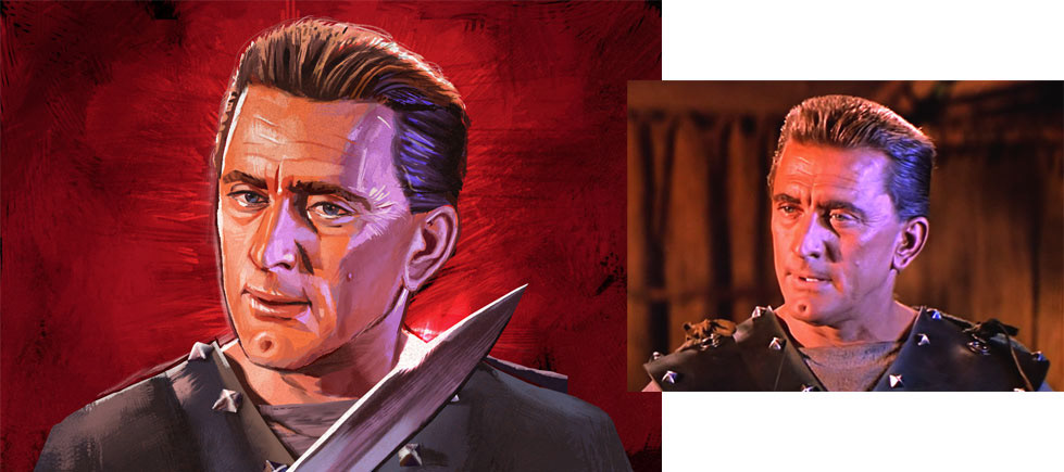
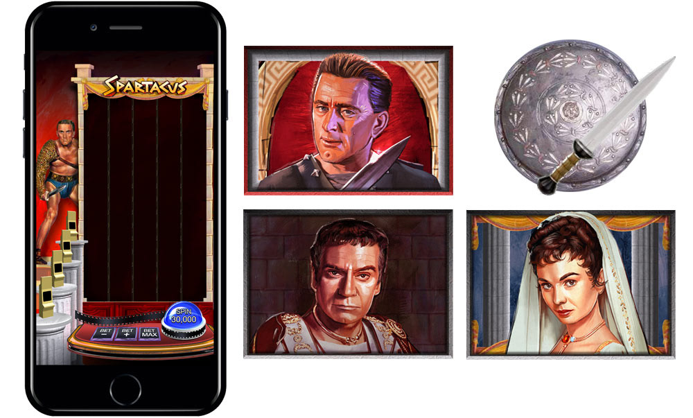
left: Spartacus (digital painting), right: film reference

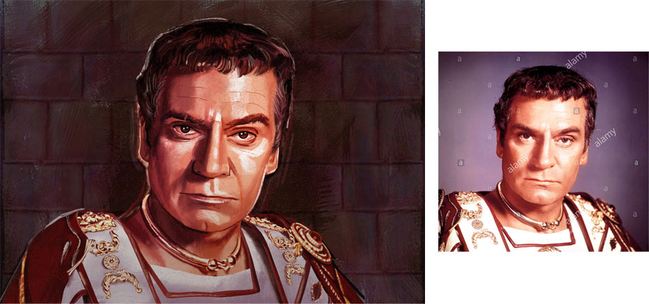
left: Crassus (digital painting), right: film reference

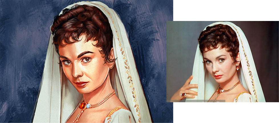
left: Varinia (digital painting), right: film reference

This is the actual art direction brief and process overview I provided to the outsource team to guide them in the portrait painting.
PORTRAIT ART
Identify large shape groups in the provided photographs and outline those shapes with the lasso tool for clean, decisive shape grabs (this step does not have to be perfect but should be close enough to original photo that the end result resembles a plane breakdown of the subject)
Perform this shape pass on all major shapes for both light and dark values (a good trick is to posterize the photo so the abstract shapes that identify the face are simplified and easier to define).
Fill each shape pass with an appropriate color so your end result resembles a reductive abstract interpretation of the face
Selectively blend these hard edged shapes you created to show plane turns in the soft areas of the facial structure. Maintain hard edges around bony surfaces or areas where the skull is closest to the skin. 
Using Photoshop’s quick mask function add a manually painted texture (canvas or gesso) and apply that texture as an overlay to the base colors you’ve established to push a more traditional look
OVERALL PAINT STYLE SHOULD MIMIC ILLUSTRATED MOVIE POSTER ART
• DO mimic traditional mediums like Airbrush, Gouache, Acrylic or Colored Pencils
• DO produce realistic depictions of the actors with stylized illustrative qualities
• DO illustrate the images from scratch as if you were illustrating with traditional mediums
• DO NOT simply push pixels from the actual photo
• DO NOT leave any indications of the actual photos
CREATE A UNIFIED COLOR PALETTE
if 1 character is lit primarily in a blue light, but the majority of the other characters are lit in normal sun, adjust the blue lit character to appear as if it’s lit in normal sun
ADJUST SUBJECTS EYE SO THEY APPEAR TO BE LOOKING FORWARD
PAINT THE CHARACTERS SEPARATE FROM THE BACKGROUND
deliver a Photoshop file @ W 1400 X H 1000 resolution
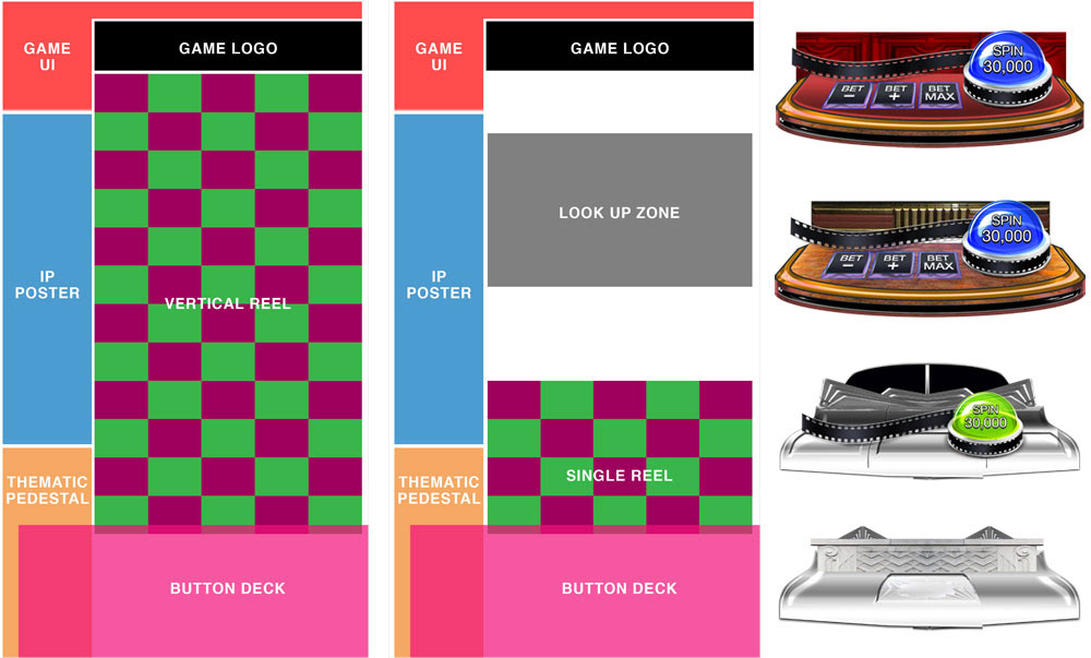
the file should contain 1 character and 1 background, each on their own layers

PLAYFIELD
As the final game assets began to take form, I moved onto designing the actual play field, the framing elements for the painted portraits and any extra symbols necessary to offer a more complete overview into what the game could potentially be.
MINI-GAMES
Finally, I moved on to creating immersive “mini-games” which allowed me to explore the depth of the property further. I also started to work on the next game around this time. So, for the “Bring Me Spartacus” picker I worked with a fellow colleague to get the visuals for the mini completed. He created the concept art while I oversaw the work he was producing.
DEFEAT DRABA
Part of the pitch required a verbal description of the work being presented, so not only did I have to create the visual I also had to come up with a somewhat competent form of gameplay walk through as well. For this mini-game I chose to homage classic fighting video games of the 80's and 90's. However, unlike classic fighting games, I had to conceive a form of play that didn’t require skill. The average slot machine player tends to stay away from skill based games and I did not want to exclude the larger audience. My solution was to design a fighting game that only required players to hit the spin button on the slot machine.
When the shield and sword symbol would resolve in a designated area on the reel it would be added to a strength meter that belonged to Spartacus. The more shields you reveal, the stronger Spartacus became. If he reaches full strength he would defeat Draba in a sequence of pre-animated fighting moves. To expand on this "game within a game" concept I also had ideas for a chariot race and lion wrestling, but for the purposes of the pitch I chose to only illustrate the fighting game.

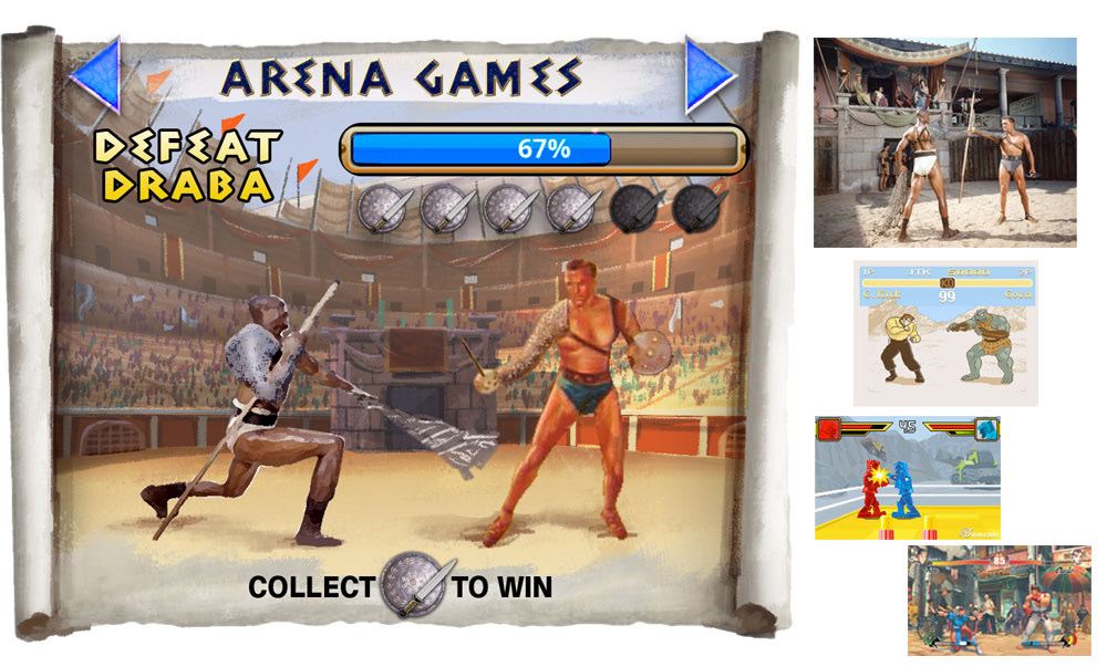
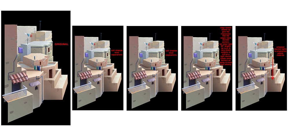
left: the battle arena (digital painting), right: film and game reference

BRING ME SPARTACUS
A simple picker game based on the infamous "I am Spartacus" scene from the film.
FINAL GAME CONCEPT
CONCEPT PRODUCTION - Jason Bourne
Because the first game was a classic Universal film, we switched gears a bit and focused on the Jason Bourne series next. We chose this series because it offered the opportunity to create a concept with more contemporary feeling embellishments, and to also work with characters that were familiar to a younger audience.
CHARACTERS
Because I was fully engaged in development and refinement of the overall game finals, the characters for Bourne were completely assigned to the outsource team. I handled the art direction and any necessary red lines on their work and these are the results of that exchange. If this were for a final game production and the Spartacus work was the illustrative goal we needed to hit I would have worked much more with the resource team to refine their art, but because it was concept I was happy with the results. You can see how I did instruct the outsource artists to turn the eyes on both Jason and Robert. Focus groups I have been involved in have shown slot machine players feel more engaged in a game when the game appears to include them. So it's a little adjustment on the art side but it tends to have bigger positive implications for the game. I also had the artists create a consistent color palette for each character that would make them appear to exist in the same environment of the playfield. The playfield however had not been designed at this point so my direction to the painters in a way helped me organically settle on the playfield colors.

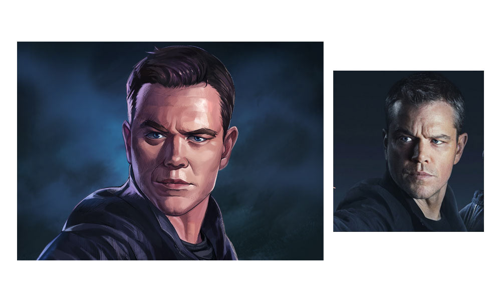
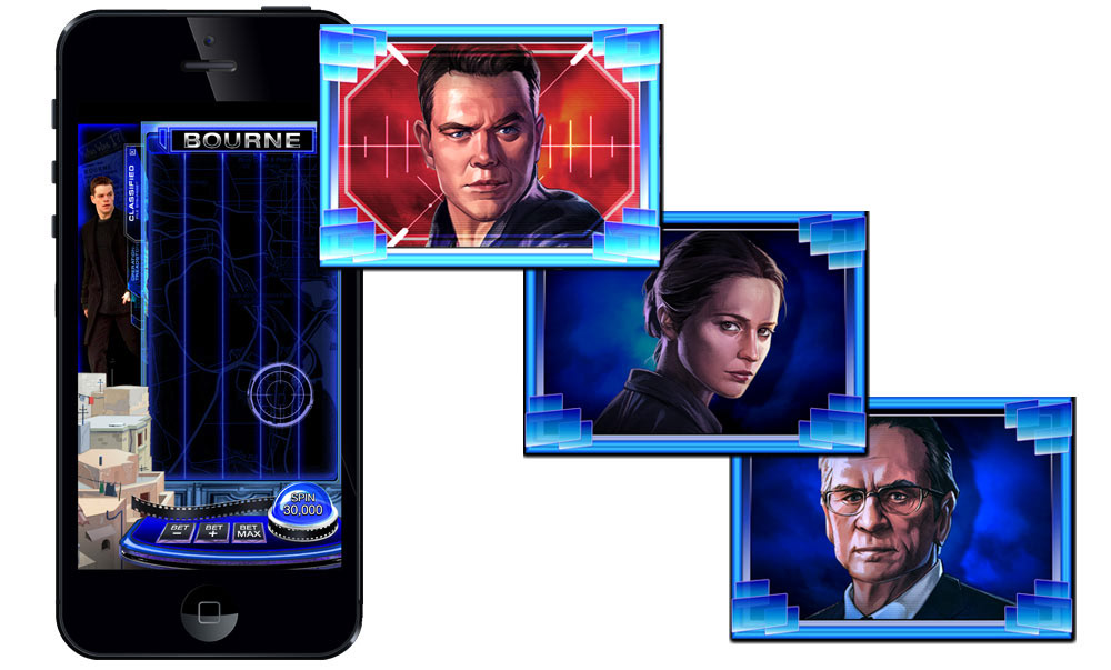
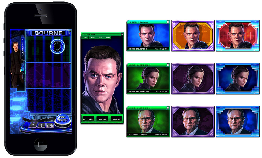
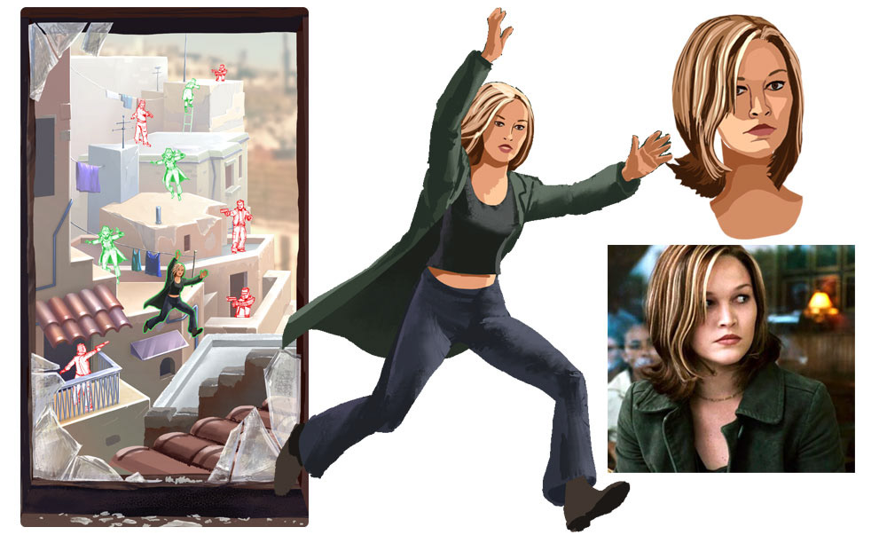
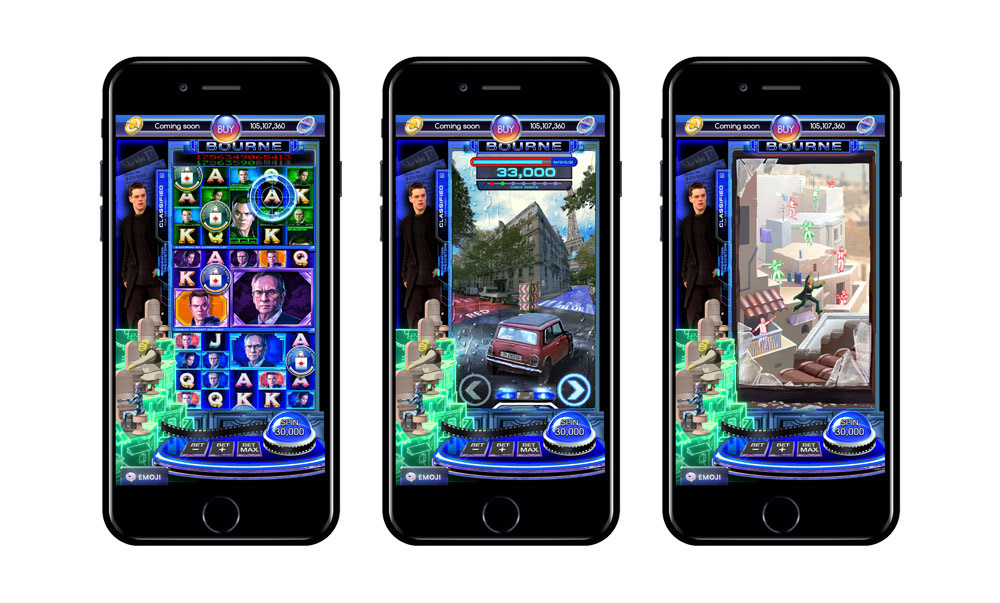
left: Jason Bourne (digital painting), right: film reference

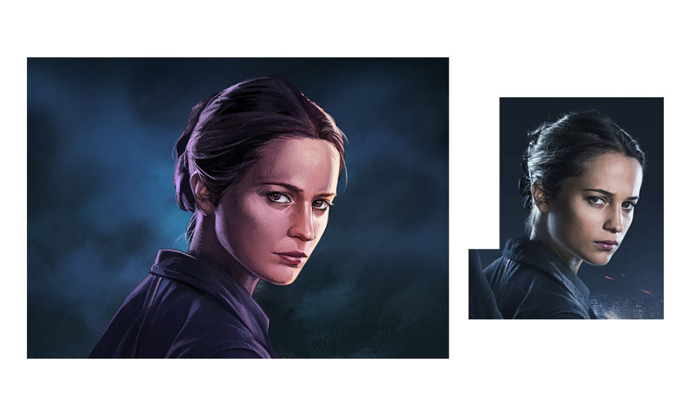
left: Heather Lee (digital painting), right: film reference


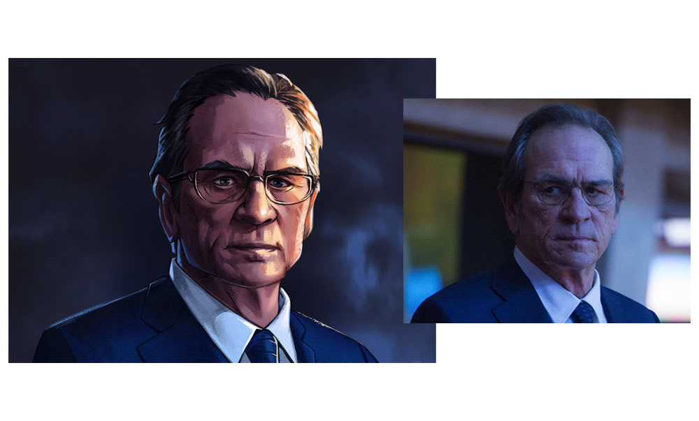
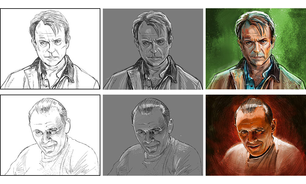
left: Robert Dewey (digital painting), right: film reference

PLAYFIELD
Because I wanted to encapsulate the Bourne series into one game concept, I took a lot of time going through each film to come up with a common thread that would both stay true to the movie's essence as well as offer some engaing gameplay. The vertical orientation of the playfield was something I ended up using to my advantage, but what is evident in this first concept is the LCD theming that became the basis for the game design. The miniature rendering was still being worked on by the outsource team and what you see here is one of its early render stages. You can also see how the color palette of the characters helped to me to settle on a palette for the playfield.
MULTI-REEL PLAYFIELD
The vertical orientation gave me the idea to split the reel into 3 multi-reels. Each reel represented a different storyline in the series and had a unique graphic approach associated to them. The scope reticule would serve as a roaming element on the playfield and would help to tie the three reels together. This of course dictated the need for 3 sets of unique symbols. I guess you can say I'm a glutton for punishment because I'm just inventing more work for myself, but I didn't mind, my goal was to really show Universal what was possible.
MINI-GAMES
To continue the theme of giving myself more work, I moved into the mini-gams for Bourne at this stage. The richness of content from such an exciting property offered so many ideas that could be turned into a game. However, my time was running out so I had to make decisions that would help move the work along in a realistic manner.
SAVE NICKY PARSONS
This first game evolved out of the thematic miniature that was designed for the Bourne playfield. Nicky Parsons is the character portrayed by Julia Stiles in the Bourne Supremacy. Because I had a scene on hand from the film already created as an asset, I came up with a way to use it further by incorporating it into a shooting gallery type game. Apologies to Julia for depicting her this way, (it's pretty rough) but to visualize this game I had to draw up a game sprite version of her character. The idea was to have an animated Nicky escape across the rooftops while Desh the hitman chased her. By touching the screen, you (playing as Jason) would fire shots at Desh to obstruct his movement which would in turn help Nicky reach your location safely behind the broken glass in the foreground.

This was also the first painted pedestal I received from the outsourcers so I included some of the art direction dialog I had with them.
MINI COOPER CHASE
The idea for this game at its simplest level is a left/ right choice game. However, if you've been reading along you know what's coming. I like to work so why change that flow now?
If you have ever seen an action movie you know car chases are staple sequences. Bourne was no exception. So for this game I referenced the Bourne Identity and the Mini Cooper car chase through Paris. Of course an internet search yielded no optimal results for the game angle I needed so I enlisted the aide of Google Maps as my go to resource.

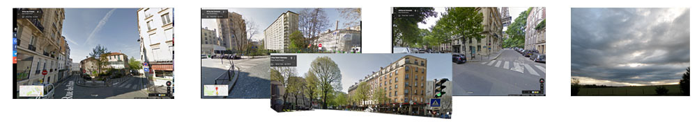
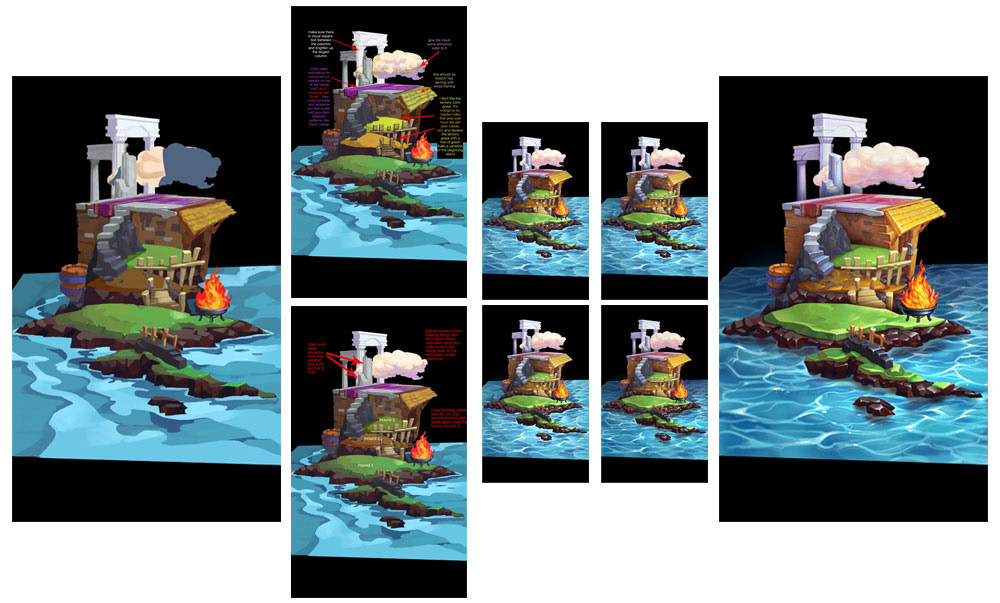
reference used to roughly represent Paris
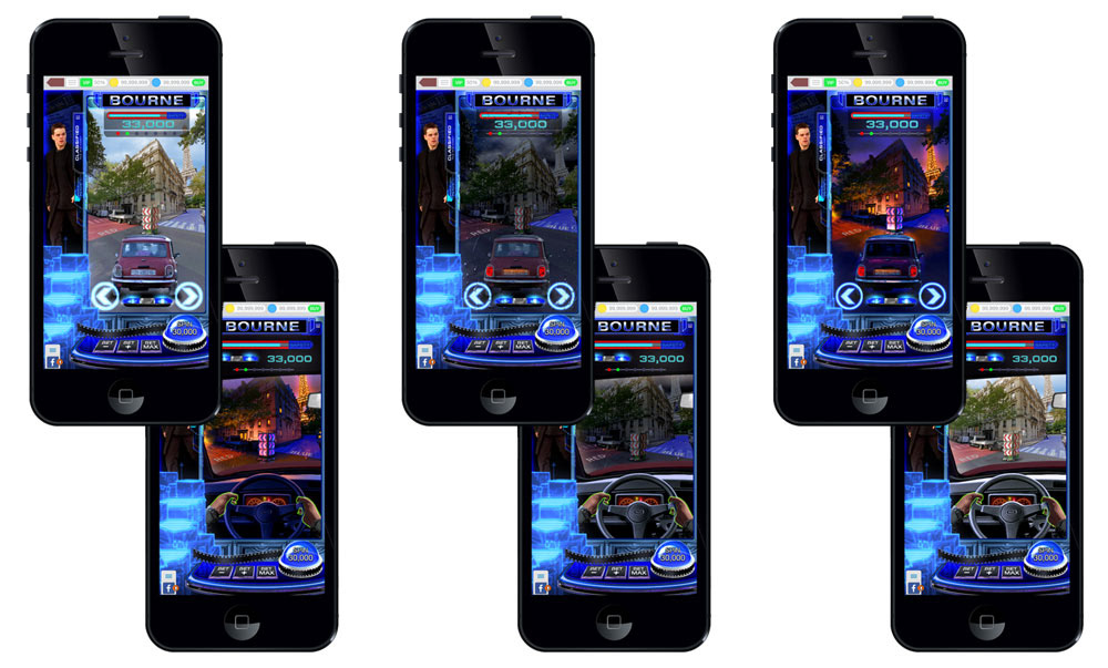
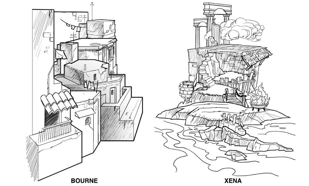
I tried multiple looks for the game, including nighttime, rainy and daytime scenes. I even created options for the actual UI that players would engage with that worked for both 1st and 3rd person gameplay. Ultimately, I decided to combine pieces from each pass for the final concept.
The Mini-Copper vehicle that Jason drove had unique characteristics to it that made it identifiable as the Bourne Mini-Cooper. Because I wanted Universal to see actual film props represented, I took screenshots of multiple frames from the film for the rear and side profiles of the car. I then stitched these shots together to create a believeable 3D version of the car.

exploration passes

FINAL GAME CONCEPT
CONCEPT PRODUCTION - Xena
To round off the pitch we also added the episodic fantasy series Xena as a concept. We wanted to show how we can work with a series that had multiple storylines, characters and settings and break all of that down into a cohesive game. Fantasy is also a popular genre in slots, so Xena was an easy choice for the final game.
CHARACTERS
Like Bourne these characters were completely assigned to an outsource team. Unfortunately we ran into some hiccups with these because the authoring artists were not achieving the desired finish level we required. They got a bit lost in the idea of illustrated movie poster art at the cost of the reality of the actual actors. I provided art direction and redlines as much as I could but because of time constraints I ended up personally painting Xena. She's the star of the IP so I wanted to ensure our pitch painting did in fact look like her.

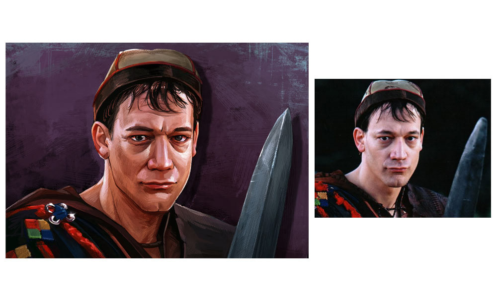
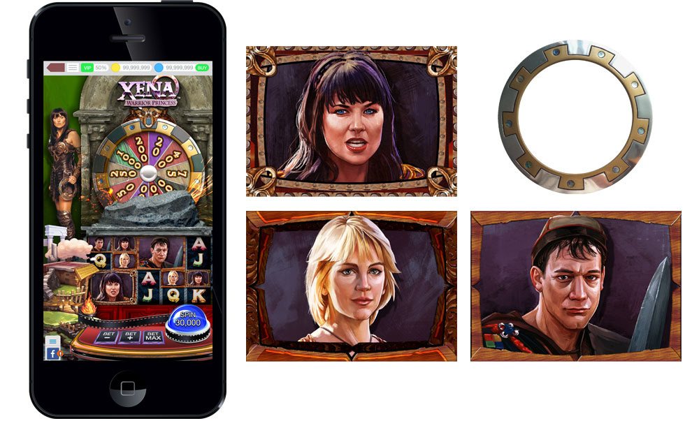
left: Joxer (digital painting), right: reference

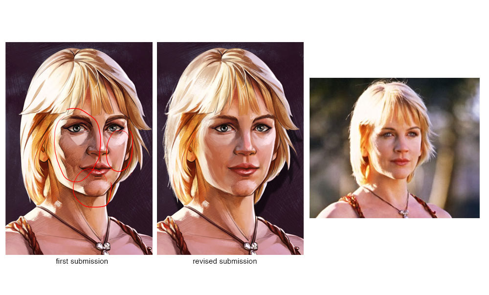
left: Gabrielle (showing problems), right: reference

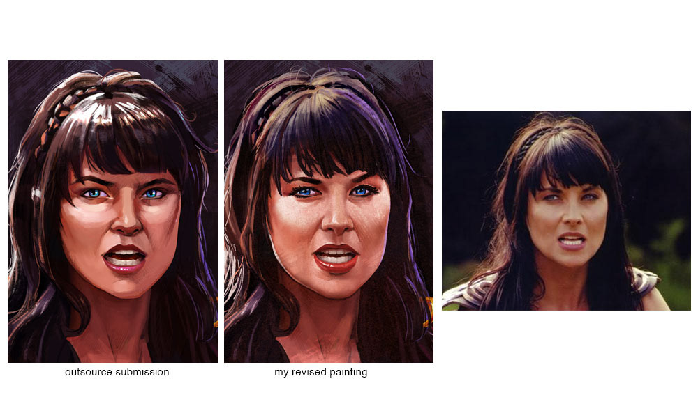
left: Xena (showing my revision), right: reference

PLAYFIELD
The base game for Xena was designed to have a progressive jackpot function actually built onto the play field. Loosely speaking this jackpot function would always be active as a wheel element, during base game play. When the "Chakram" symbol would index on the play field, it would activate the Chakram wheel. Due to the fact that this weapon resembles a slot machine wheel, it was an ideal way of incorporating that prop into the game. At the same time I designed the playfield, I also designed rough frames for the characters. I made a rough attempt here to show how heirarchy works in a slot game by adding time period embellishments to Xena, the high value symbol for the game.
MINI-GAMES
At this point, I was pretty overwhelmed with directing the support resources and pulling everything together. I basically had no time for a Xena mini-game so I once again resorted to the help of my colleague. I gave him verbal directions for what I wanted and he pulled together an awesome interpretation of my vision.
DESTROY THE HYDRA
At its heart, this game is basically a picker game. (you choose a spot on the playfield and win what is hidden behind that spot) However, to homage the fantasy of Xena, we took this simple idea and turned it into a fun concept.
As Chakrams resolve on the playfield, they would be added to your arsenal. The player was then able to control Xena and have her launch the Chakram at the 7-headed Hydra. If you were lucky enough to sever a Hydra head you would then be allowed to choose a masked object that revealed a variety of gold relics. The amount of Chakrams you would win on a spin would determine how many throws you had.
The second pedestal painted by the outsource team was also delivered at this point. Here are some of the art direction notes I provided.
FINAL GAME CONCEPT
SUMMARY
All of the above work (including many more iterative process samples not shown) were created in about a 3 week period. The games were created solely for a pitch presentation, they are not validated for actual production.
At the end of this pitch package I was once again approached with yet another opportunity to create a similar package for 20th Century Fox. The end result however, of both pitches, acquired Universal Studios as a partner and I was tasked with overseeing the creative direction of game content for this partnership.
Back to Top