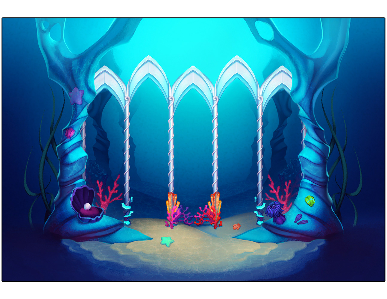
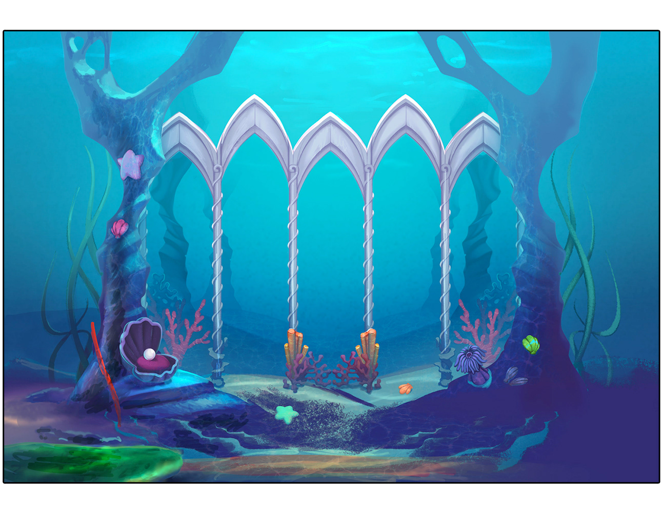
Mermaids Charm - Game Background
A rough paint-over and notes were provided to the production team to resolve the value and saturation structure they were struggling with in their original iteration of the BG. Because the artists working on this game had a very distinct style I did not want to offer heavy-handed directions that could potentially modify their design voice. As a compromise, I offered notes to refocus their understanding of how underwater paintings should be handled and then did a quick rough for further visual emphasis. Having this visual reminder handy as they made their revisions helped them adjust their painting to achieve better form and shape clarity.
before BG by production artist
after BG with rough paint directions
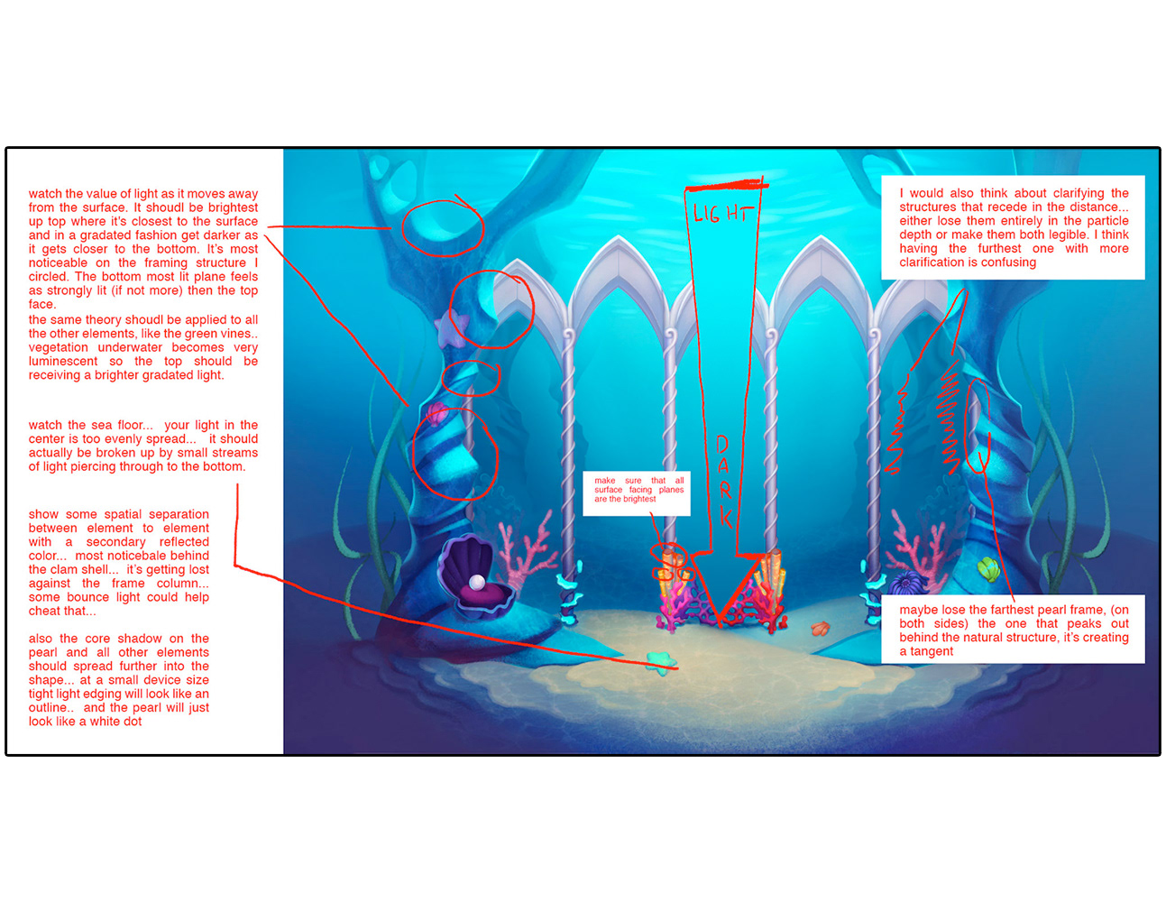
written notes
Lucky Koi - Live-Ops promotion
This paint-over was given to the artists working on this project to show how better use of hue, value, and saturation could emphasize the focus of the promotion, the koi fish. In the original painting, the general hierarchy of elements was flat and confusing and required a proper focal point.
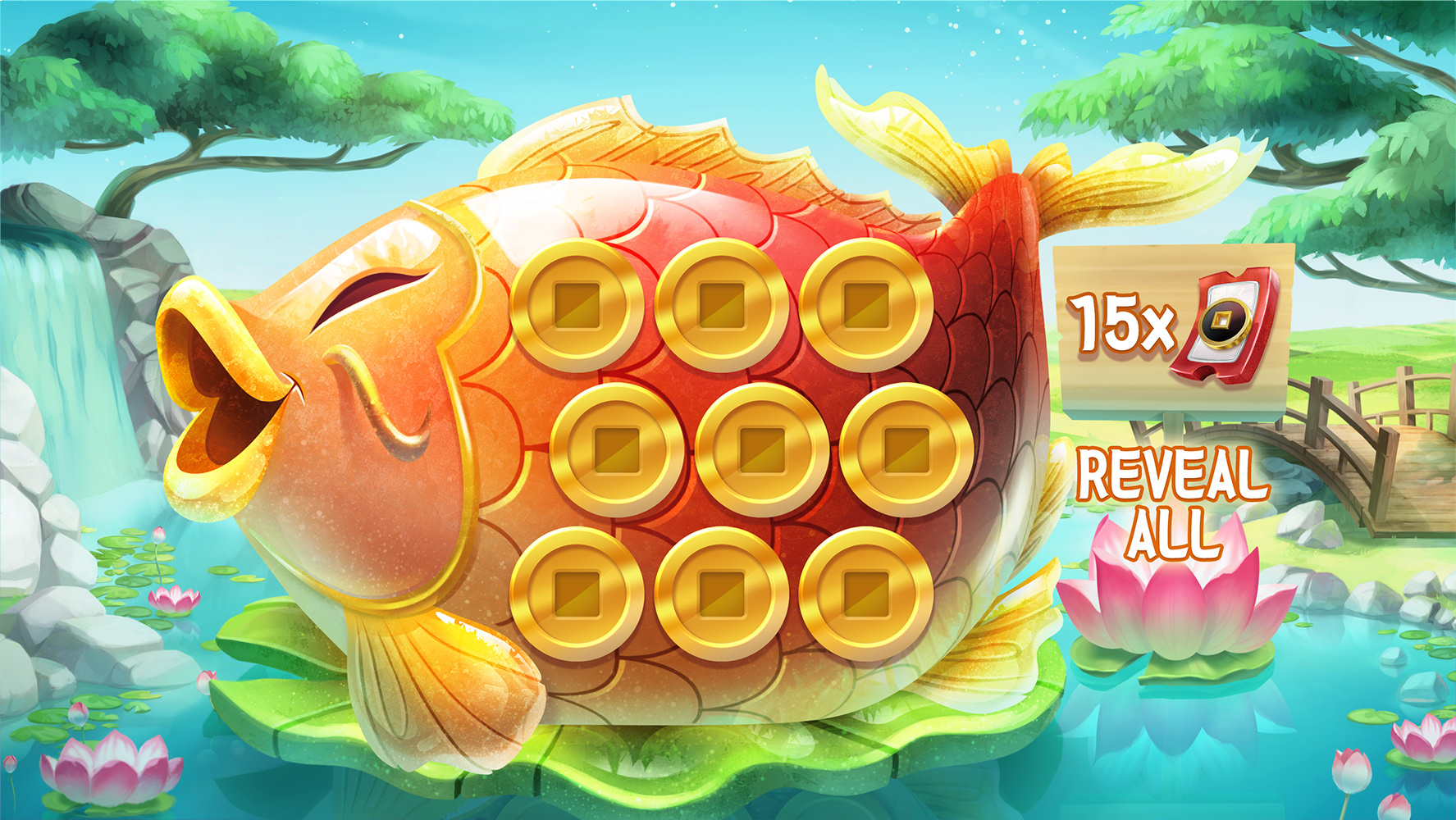
production artist before iteration
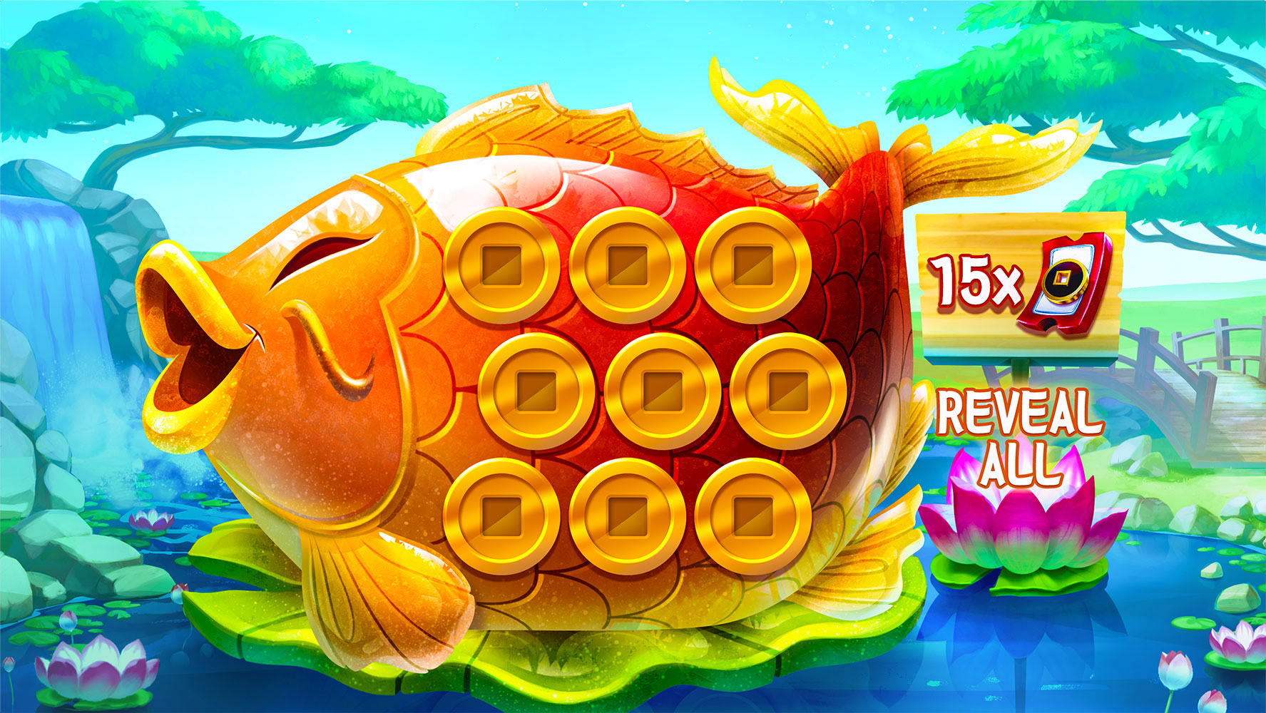
my rough paintover to show how to achieve better focal clarity
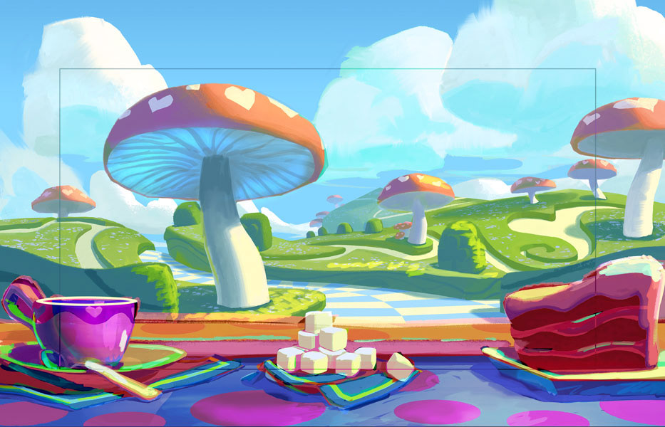
Alice - Game Background
I provided this rough color adjustment to show the artist how he could improve his desaturated palette with more vibrant and inviting colors. This background would be used in an existing casual game catalog that had a playful style, so the desaturated palette required a new approach to integrate well with other games. In lieu of written notes, I did this quick color pass to show the artist how to look at his painting from a new perspective.
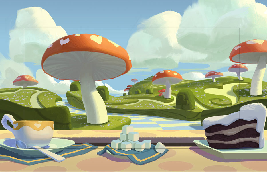
before with desaturated palette
after showing enhanced color palette
Mystic Wilds - Live-Ops Quest
Because the image matched the look and feel of already finalized game assets I did not want to repaint it entirely. So, I worked with the existing art and introduced more of the grayscale mid-tone values it was missing in its tonal structure, (primarily in the middle and background planes.) The lack of these values in the original caused it to have high levels of contrast throughout and that made it hard to visualize a real sense of depth. With images like this that are typically viewed on smaller devices like a mobile phone, game artists have to be conscious of logically distributed value scales in their work. Unfortunately, proper value is often overlooked because artists believe rendering is what makes an image successful.
As with all my AD notes, I provided the authoring artist this before and after look at the image so she could visually understand the differences I was describing. I wasn't too heavy-handed in my makeover, but if you squint at the images you may be able to see what my goal was in this exercise.
before
after
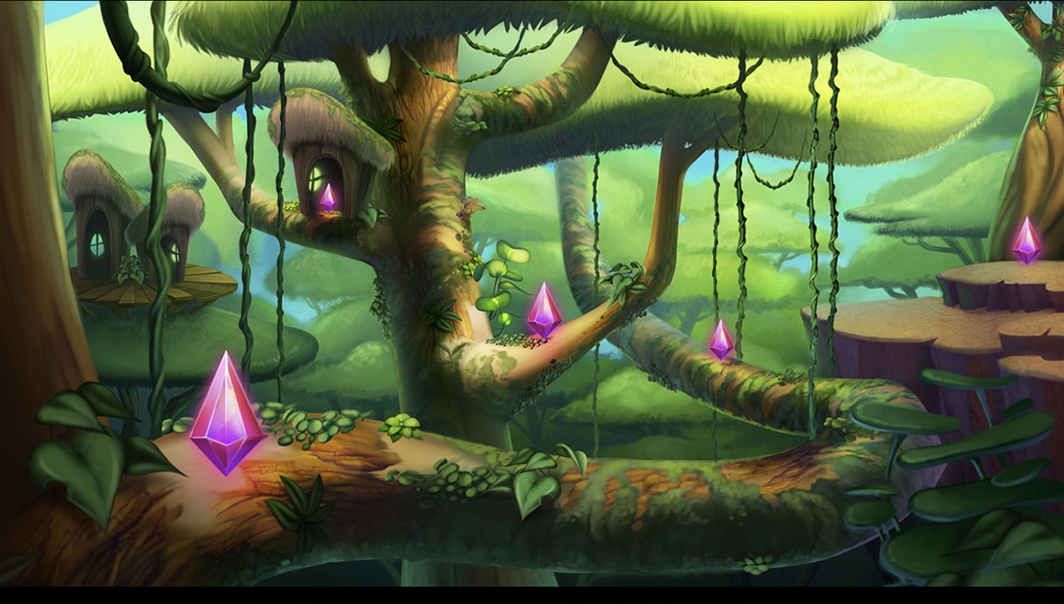
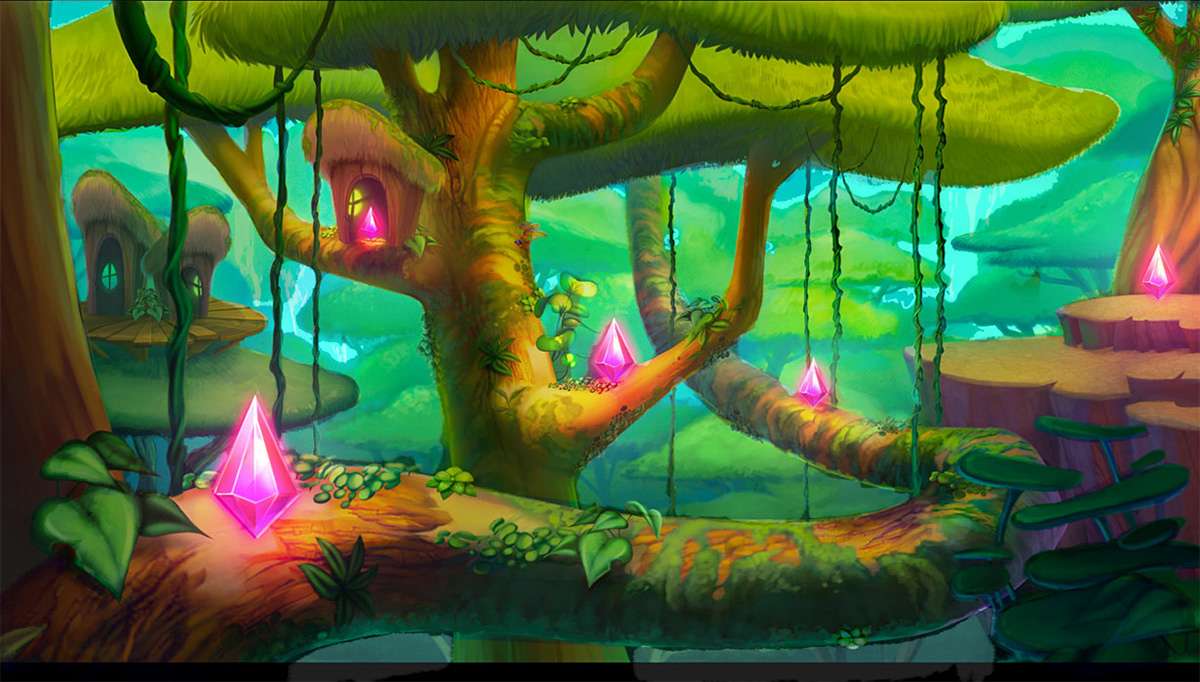
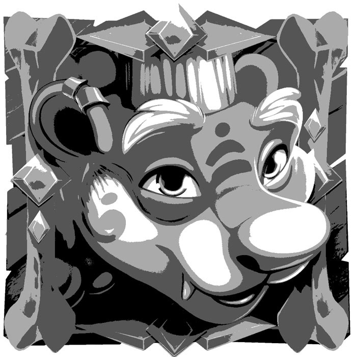
Enchanted Jungle
This character did not have a proper light source evident in the initial painting which made it appear flat and lacking proper form. I provided a rough value adjustment to show how to achieve better dimensional form. An easy way to identify such issues is to simply view an image stripped of its color.

before color
before value

after color